
< CSS小技巧:类似photoShop的混合模式(mix-blend-mode / background-blend-mode)使用 >

文章目录
- 👉 前言
- 👉 一、使用 `background-blend-mode` 实现图片任意颜色赋值技术
- > HTML代码
- > SCSS代码
- 👉 二、图片的 Glitch Art 风
- > HTML代码
- > CSS代码
- 👉 三、使用 `mix-blend-mode` 实现光影文字效果
- > HTML代码
- > CSS (scss)代码
- 👉 五、使用混合模式叠加实现文字波浪效果
- > HTML代码
- > CSS(scss)代码
- 👉 六、多图融合(类似PS图层蒙版)
- > HTML代码
- > CSS(scss)代码
- ✈ 搜集材料不易,请小伙伴们多多三连支持一下!
- 参考文献
- 往期内容 💨
👉 前言
CSS3 新增了一个很有意思的属性 mix-blend-mode ,其中 mix 和 blend 的中文意译均为混合,那么这个属性的作用直译过来就是混合模式。当然,我们我们通常称之为混合模式。
混合模式 最常见于 photoshop 中,是 PS 中十分强大的功能之一。当然,瞎用乱用混合模式谁都会,利用混合模式将多个图层混合得到一个新的效果,只是要用到恰到好处,或者说在 CSS 中利用混合模式制作出一些效果则需要对混合模式很深的理解及不断的尝试。
具体使用文档: 👉 mdn web docs - mix-blend-mode 👈
接下来,就让小温给小伙伴们将近几个合理的使用方案吧!
👉 一、使用 background-blend-mode 实现图片任意颜色赋值技术
本节内容并非使用 mix-blend-mode,而是 background-blend-mode 。在这简单区分一下这两个属性的区别:
- mix-blend-mode 用于多个不同标签间的混合模式
- background-blend-mode 用于单个标签间内背景图与渐变背景间的混合模式。
- background-blend-mode 的可用取值与 mix-blend-mode一样,不重复介绍,下面直接进入应用阶段。
> HTML代码
原图
红色
绿色
渐变色
> SCSS代码
$img: 'https://user-images.githubusercontent.com/8554143/34239266-232bdfc0-e641-11e7-8792-408782aaa78e.png';.pic {width: 200px;height: 200px;margin: 50px;text-align: center;font-size: 42px;line-height: 420px;float: left;background-image: url($img);background-size: cover;
}.red {background-image: url($img), linear-gradient(#f00, #f00);background-blend-mode: lighten;background-size: cover;
}.green {background-image: url($img), linear-gradient(green, green);background-blend-mode: lighten;background-size: cover;
}.gradualChange {background-image: url($img), linear-gradient(#f00, #00f);background-blend-mode: lighten;background-size: cover;
}

background-blend-mode 实现图片任意颜色赋色技术总结:
综上,我们确实只需要两行代码就可以实现白色底色黑色主色图片的任意颜色赋色技术。
{background-image: url($img), linear-gradient(#f00, #00f);background-blend-mode: lighten;
}
其中,background-image 的第二值就是你希望赋值给的渐变色(当然,渐变色可以换成纯色)。
我们同时给一个标签设置了背景图片和渐变色,然后利用了 background-blend-mode:lighten 这个关键属性,达到了类似 PS 里的混合模式效果。
看起来 background-blend-mode 名为混合模式,但似乎表现上更像是 PS 当中的一种的剪切蒙板,混合模式是修改图片本身,蒙版跟遮罩都是在图片上一层通过叠加其他层对图像进行调整。
那么由此方法本身可以想到,一些能对图形进行色彩调整的 CSS 属性是否也能达到同样的功能呢?比如之前文章说到的 filter 滤镜,还有其他相关的CSS属性呢? 值得思考!
点击跳转:< CSS小技巧:filter滤镜妙用>
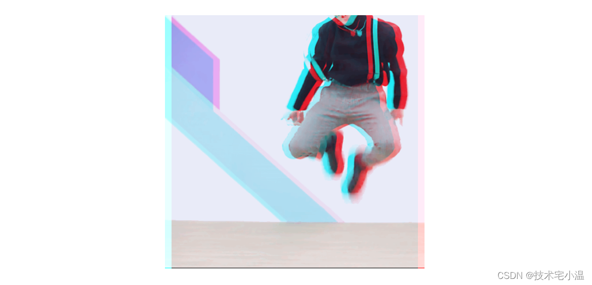
👉 二、图片的 Glitch Art 风
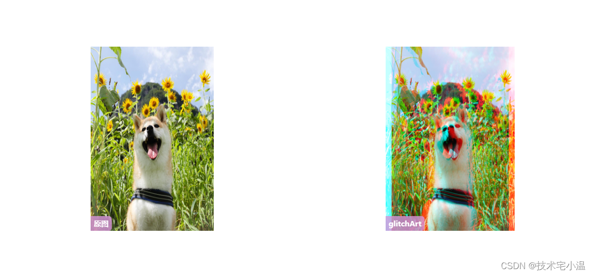
在这篇文章中 CSS故障艺术,介绍了利用混合模式制作一种晕眩感觉的视觉效果,有点类似于抖音的 LOGO。非常值得小伙伴们学习学习!
实现原理: 给两张同样的图片,叠加上 青色#0ff 和 红色#f00,并且错开一定的距离,两张图都要加上 background-blend-mode: lighten,其中一张再加上 mix-blend-mode: darken;
因为图片本身不是红色和青色的,所以需要通过 background-image 叠加上这两种颜色,并通过 background-blend-mode: lighten 让其表现出来。
为了保持中间叠加部分的原色,需要再叠加一个 mix-blend-mode: darken 反向处理一下。
> HTML代码
> CSS代码
.mix {width: 400px;height: 400px;background: url($img), #0ff;background-blend-mode: lighten;&::after {content: '';position: absolute;margin-left: 10px;width: 400px;height: 400px;background: url($img), #f00;background-blend-mode: lighten;mix-blend-mode: darken;}
}
当然,这里使用 Gif 也是完全可以的,我们替换下我们的 Gif ,看看会得到什么样的一种效果:
示例地址: https://codepen.io/Chokcoco/pen/rNKXwOb
👉 三、使用 mix-blend-mode 实现光影文字效果
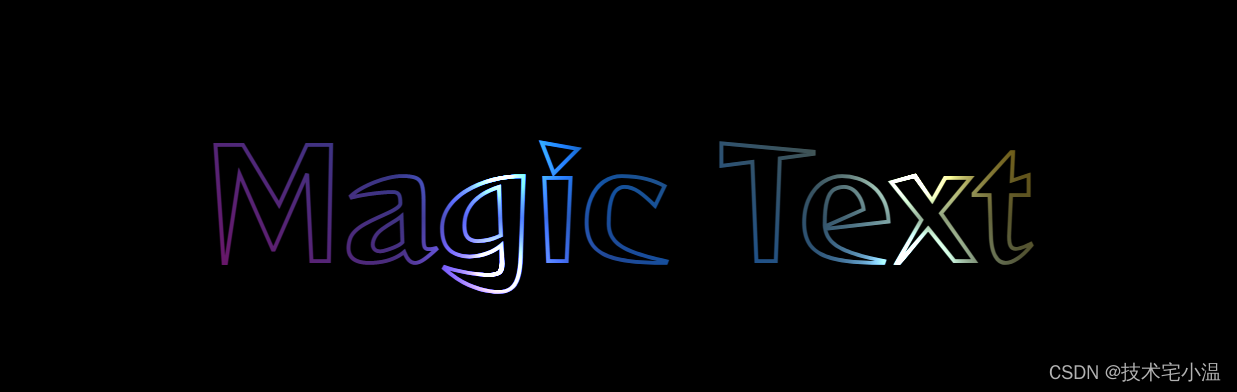
实现原理:
- 利用混合模式
mix-blend-mode: multiply生成渐变色的文字。 - 利用
mix-blend-mode: color-dodge混合模式,给文字加上点缀,实现美妙的光影效果
> HTML代码
Magic Text
> CSS (scss)代码
@import url("https://fonts.googleapis.com/css2?family=Reggae+One&display=swap");html,
body {width: 100%;height: 100%;display: flex;font-family: "Reggae One", cursive;background: #000;
}.g-container {margin: auto;
}p {position: relative;font-size: 12vw;line-height: 16vw;// color: #9a9acc;overflow: hidden;-webkit-text-stroke: 3px #7272a5;&::before {content: " ";width: 100%;height: 100%;position: absolute;left: 0;top: 0;background-image: linear-gradient(45deg, #ff269b, #2ab5f5, #ffbf00);mix-blend-mode: multiply;}&::after {content: "";background: radial-gradient(circle, #fff, #000 50%);background-size: 25% 25%;position: absolute;top: -100%;left: -100%;right: 0;bottom: 0;mix-blend-mode: color-dodge;animation: mix 8s linear infinite;}
}@keyframes mix {to {transform: translate(50%, 50%);}
}
参考文献:奇思妙想 CSS 文字动画
👉 五、使用混合模式叠加实现文字波浪效果
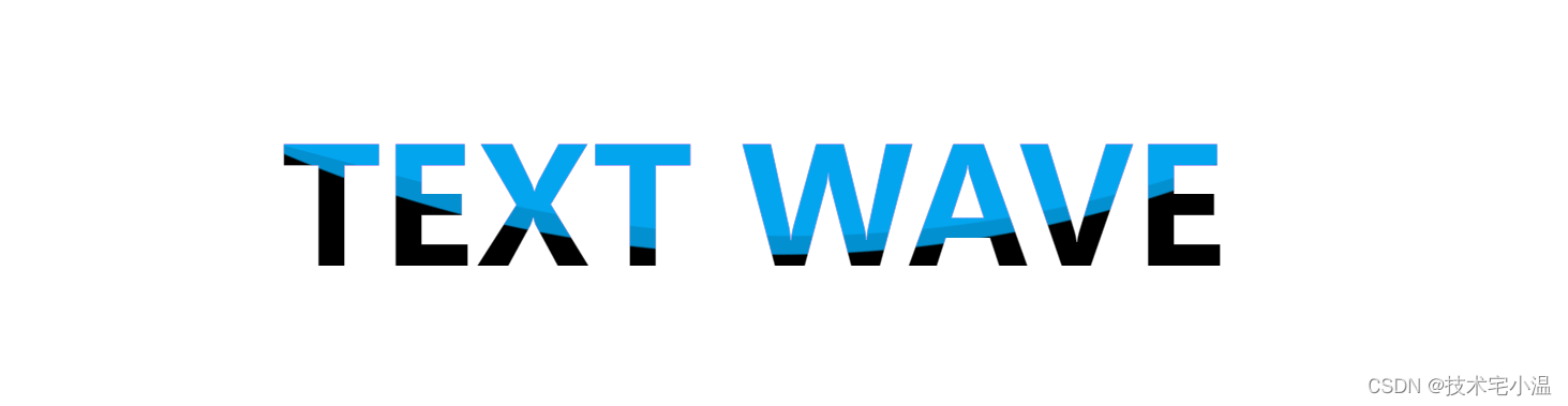
传统的文字镂空展示背景更多的是使用 background-clip 背景剪切。
但是本效果文字的背景是动画效果,无法使用 background-clip 进行穿透,这里通过混合模式 mix-blend-mode 的特性实现。
> HTML代码
TEXT WAVE
> CSS(scss)代码
html, body {width: 100%;height: 100%;display: flex;
}.g-container {margin: auto;
}p {position: relative;font-size: 120px;font-weight: bold;background: #fff;color: #000;overflow: hidden;&::before,&::after {content: "";position: absolute;top: -923px;left: 50%;width: 2000px;height: 2000px;border-radius: 45% 48% 43% 47%;transform: translate(-50%, -50%);background: rgba(3, 169, 244, .85);animation: rotate 10s infinite linear;z-index: 1;mix-blend-mode: lighten;}&::after {border-radius: 43% 47% 44% 48%;animation: rotate 10s infinite .5s linear;}
}@keyframes rotate {0% {transform: translate(-50%, -50%) rotate(0);}100% {transform: translate(-50%, -50%) rotate(360deg);}
}
效果示例地址: 点击跳转
👉 六、多图融合(类似PS图层蒙版)
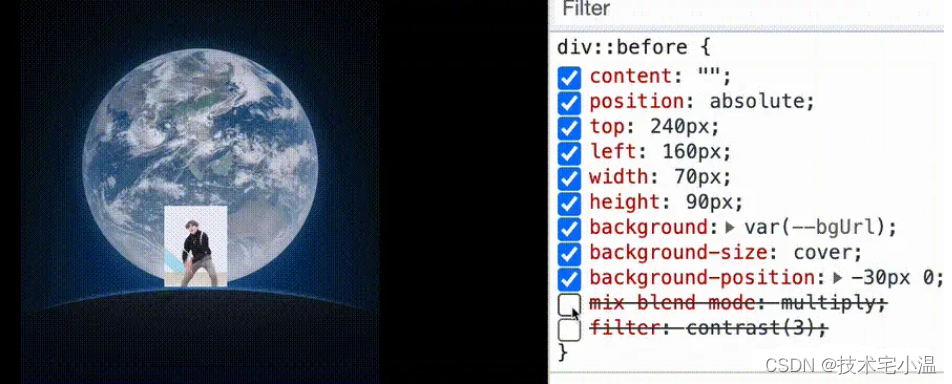

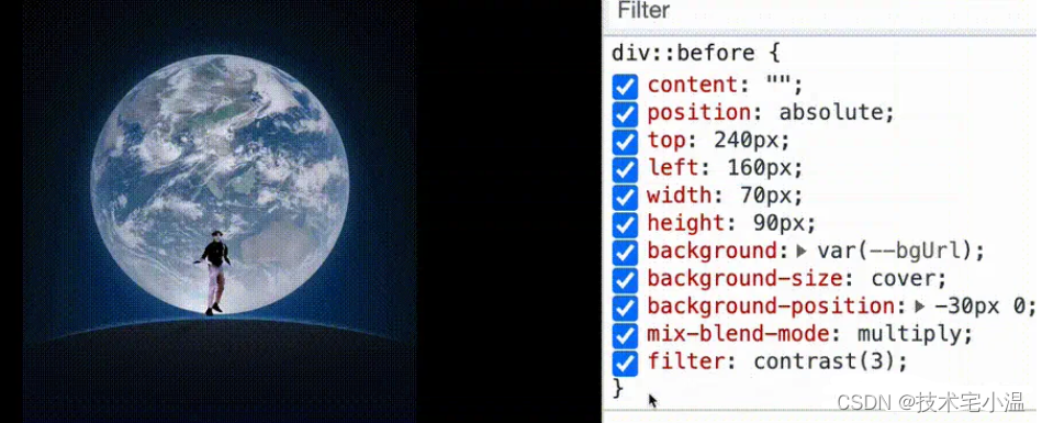
通过混合模式 mix-blend-mode: multiply,巧妙的消除了大部分非人物的背景,再通过 filter: contrast(3) 加深这个效果,彻底去掉动图背景,融入了我们的地球背景中。
这样,我们巧妙的将两张图,融合成了一张图。
当然,多调试调试,还能有不一样的效果,这里我实现了两种不一样的效果,完整的代码如下:
> HTML代码
> CSS(scss)代码
div {position: relative;margin: auto;width: 400px;height: 500px;flex-shrink: 0;background: url(earth.jpg);background-size: cover;background-position: 0 -150px;background-repeat: no-repeat;&::before {content: "";position: absolute;top: 240px;left: 160px;width: 70px;height: 90px;background: var(cxk.gif);background-size: cover;background-position: -30px 0;mix-blend-mode: multiply;filter: contrast(3);}
}.white {&::before {mix-blend-mode: color-dodge;filter: invert(1) contrast(3);}
}.black {&::before {background: var(--bgUrl), #000;background-size: cover;background-position: -70px 0;mix-blend-mode: multiply;filter: contrast(3);}
}
示例demo地址: 点击跳转
综上,可以看出,虽然CSS在某些可视化数据方面比较鸡肋。但是也不是非常,在需求有需要的情况下,通过css还是可以设计出很复杂的可视化效果,配合JavaScript对dom元素直接进行样式操作,即可实现可视化数据展示,不过性能方面比较差就是了(原因:频繁的重绘)!
✈ 搜集材料不易,请小伙伴们多多三连支持一下!
参考文献
- mdn web docs - mix-blend-mode
- CSS混合模式mix-blend-mode/background-blend-mode简介 - 张鑫旭大大
- CSS故障艺术 - 掘金大佬chokcoco
- 开局一张图,构建神奇的 CSS 效果 - 掘金大佬chokcoco
- CSS Inspiration – CSS灵感 - 掘金大佬chokcoco
往期内容 💨
🔥 <开源: 推荐10个开源的前端低代码项目>
🔥 < CSS小技巧:那些不常用,却很惊艳的CSS属性 >
🔥 < 开源项目框架:推荐几个开箱即用的开源管理系统 - 让开发不再复杂 >
🔥 < JavaScript技术分享: 大文件切片上传 及 断点续传思路 >
🔥 < 每日技巧: JavaScript代码优化 >
上一篇:Linux命令·ln